Visualising poverty
The MPI produces charts and graphics for analysis, but it can be useful to remember what these numbers mean in practice. MPI data is based on survey data collected predominantly by official staff, known as enumerators, organised by either international or national programmes, entering homes and asking householders a set of survey questions. That data, sampled for a population, then feeds the computation and analysis of MPIs. OPHI works on this latter stage, developing analysis, and training national statistical offices in how to use the data collected. In this gallery of images, you can see images of what would be considered as deprivations in some MPIs. It is important to note that indicator definitions vary across MPI, which are tailored to their local context, and poverty looks different from country to country and across time. Please click on the information icon for notes on the images.
-
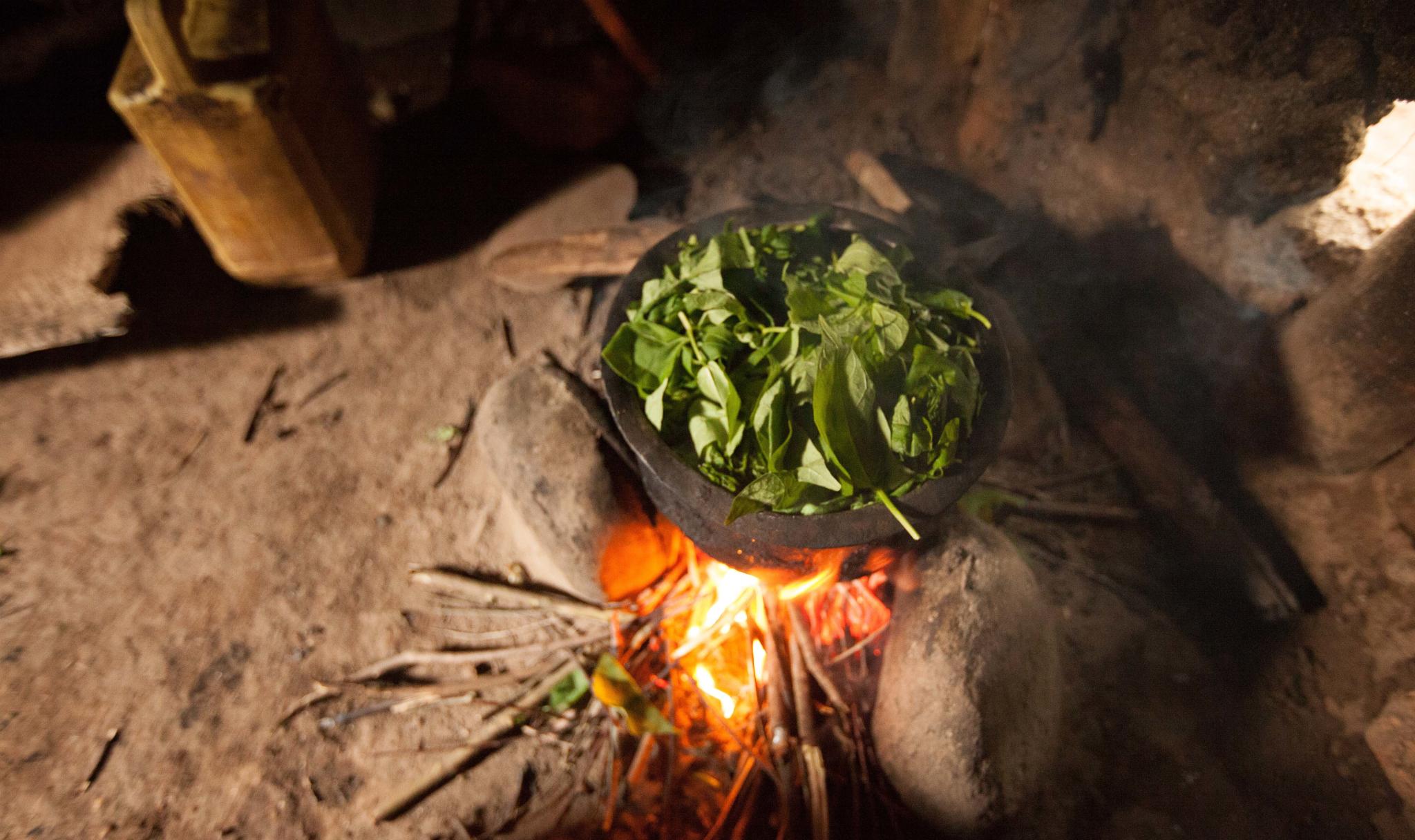
Cooking fuel is a common indicator used in MPIs. In the global MPI, a household is deprived in cooking fuel if it cooks with solid fuel, such as dung, agricultural crop, shrubs, wood, charcoal, or coal. Cooking fuel is also an important health-related indicator, since the indoor use of coal, dung, or leaded fuels is associated with ill health. Here we can see solid fuel being used for cooking in a household in Burundi.
© Johan Eriksson for Dollar Street 2015 (free to use under CC BY 4.0).
-
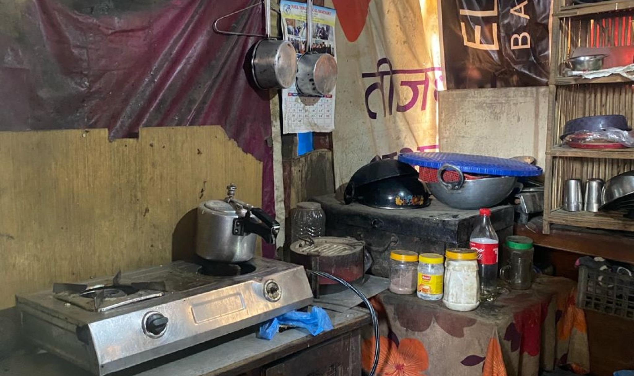
A kitchen in Nepal 2024. The gas stove pictured would typically indicate the use of clean cooking fuel, but the residents can rarely afford to cook with gas and so the primary source of their cooking fuel is wood gathered from the local riverbed or woodlands.
© Sabina Alkire and Tshoki Zangmo, 2024
-
An example of a family's deprivation in sanitation arrangements in the Ivory Coast where the family lacks their own sanitation facility and practises open defecation.
© Johan Eriksson for Dollar Street 2015 (free to use under CC BY 4.0)
-
A pit latrine toilet in Nepal 2024. In the global MPI, a household is deprived if it lacks a sanitation facility or has an unimproved sanitation facility. It is also classified as deprived if it has an improved sanitation facility which is shared with other households, as pictured above.
Unimproved sanitation relates to the use of pit latrines without a slab or platform, hanging latrines or bucket latrines. In this photo, the toilet does have slab, but it is not fitted in such a way as to help people using it.
© Sabina Alkire and Tshoki Zangmo, 2024
-
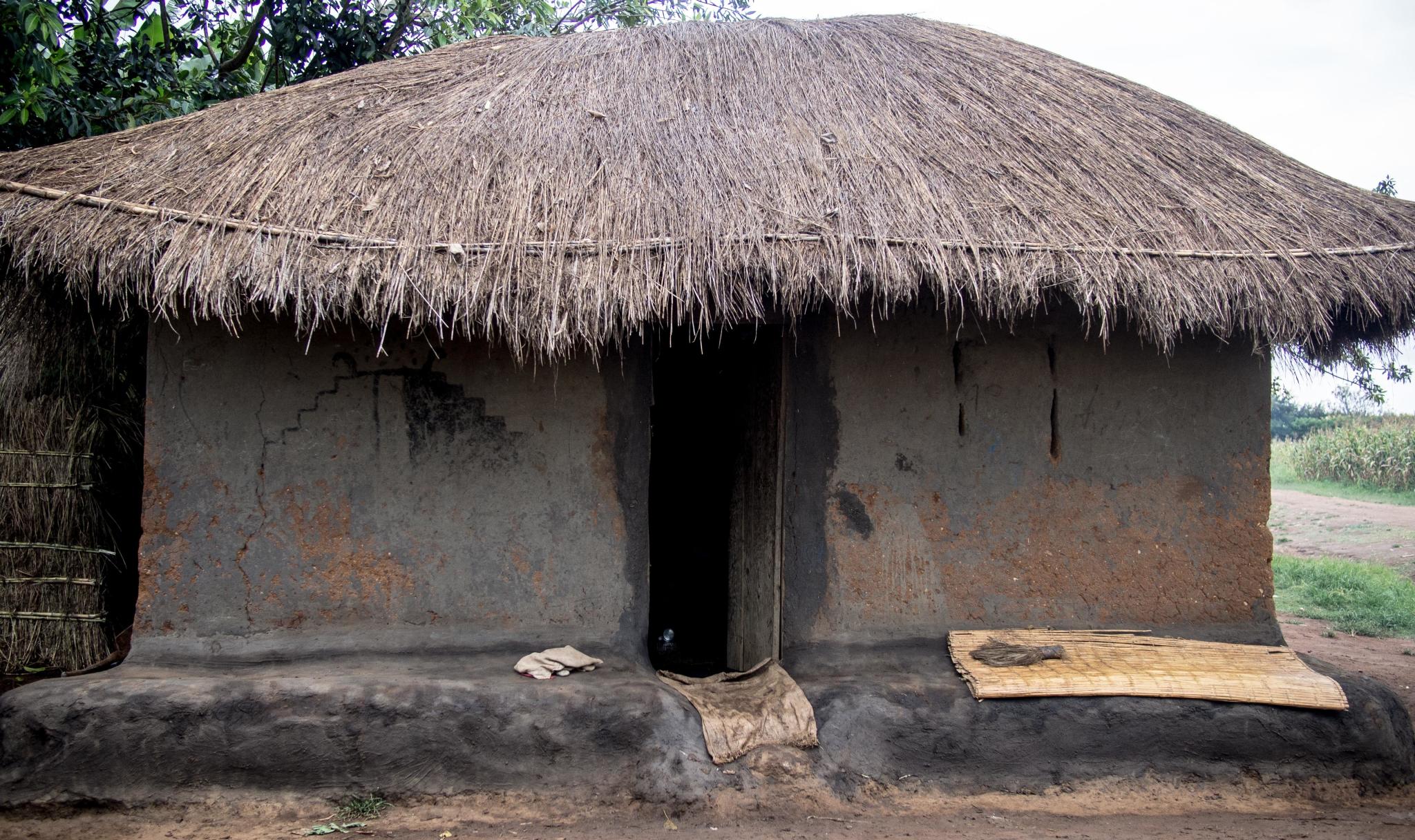
A home in Malawi made of natural materials. According the global MPI, a household is deprived if the floor is made of natural materials (mud/clay/earth, sand or dung), or if the dwelling has no roof or walls, or if either the roof or walls are constructed using natural or rudimentary materials, such as carton, plastic/ polythene sheeting, bamboo with mud/stone with mud, loosely packed stones, uncovered adobe, raw/reused wood, plywood, cardboard, unburnt brick or canvas/tent. The definitions of natural and rudimentary materials follow the classification used in country-specific DHS or MICS questionnaires.
© Zoriah Miller for Dollar Street 2015 (CC BY 4.0).
-
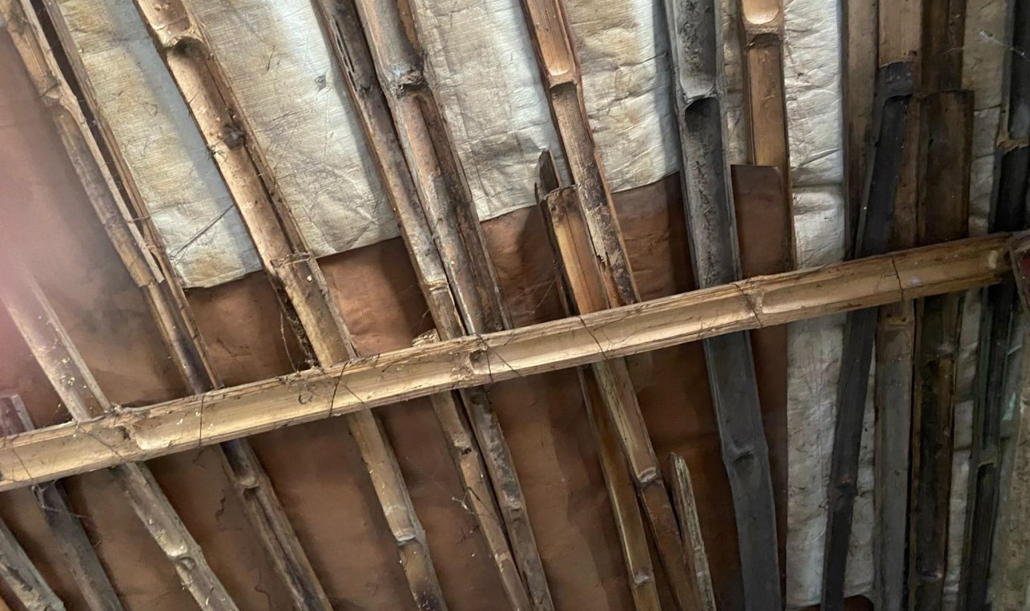
A leaking roof in Nepal made of a combination of bamboo and cardboard materials.
© Sabina Alkire and Tshoki Zangmo, 2024
-
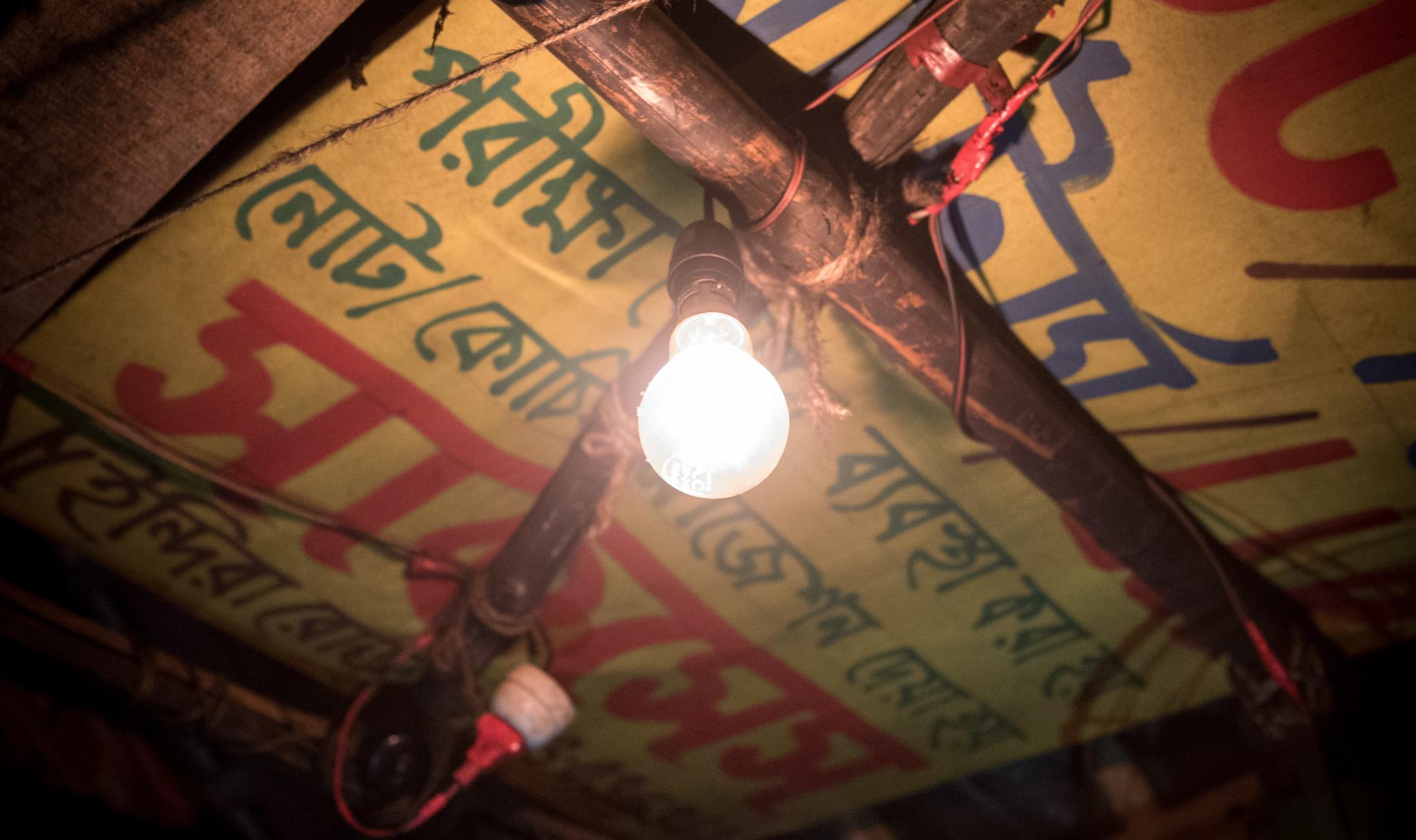
Electricity in a home in Bangladesh, 2015. In the global MPI, a household without electricity is considered deprived in this indicator.
© Luc Forsyth for Dollar Street 2015 (CC BY 4.0)
-
Multidimensional Poverty Indices generally all measure education levels within a household. The global MPI has two indicators: years of schooling and school attendance.
© Jonathan Taylor for Dollar Street 2015 (Free to use under CC BY 4.0)
-
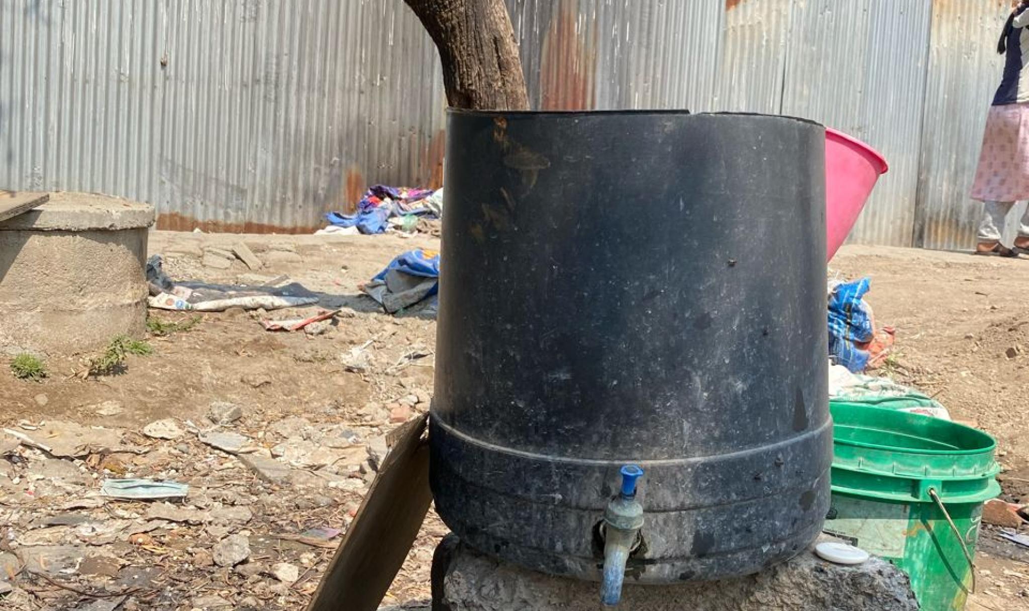
A water tap in Nepal shared by surrounding households. The water is inconstant, unsafe to drink and used for washing and ablutions. Drinking water in this neighbourhood is provided by a water tank filled by the city corporation and each household receives an allocation of five buckets of drinking and cooking water per week.
According to the global MPI, a household is deprived if its source of drinking water is not safe, or safe drinking water is a 30-minute or longer walk from home, roundtrip.
© Sabina Alkire and Tshoki Zangmo, 2024